
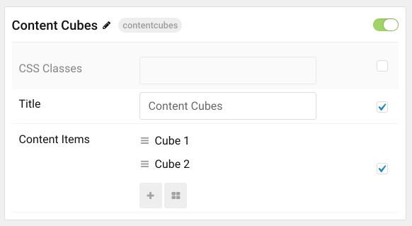
Content Cubes

The Content Cubes particle is a great way to highlight some of your best content in a way that perfectly complements the theme's design. This is a natural, and aesthetically-pleasing way to ensure that your featured content stands out.
Particle Configuration
| Option | Description |
|---|---|
| CSS Classes | Sets the CSS class for the content of the particle. |
| Title | Sets the title of the particle, as it will appear on the front end. |
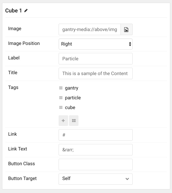
Item Configuration
| Option | Description |
|---|---|
| Image | Enter the path to the image file you wish to use for this item. |
| Image Position | Set whether the image will appear to the left or the right of the text in the item. |
| Label | Enter a label that appears on the top of the title of the item. |
| Title | Enter a title for the item. This appears on the front end. |
| Link | Enter a link that you would like the item to take visitors to when selected. |
| Link Text | Enter any text you would like to have appear as the link. |
| Button Class | Set a class that will apply to the link's button for this item in the particle. |
| Button Target | Set the way you would like the link to open. You can choose between Self and New Window. |
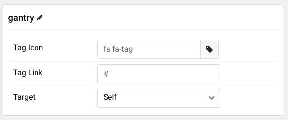
Item Tags Configuration
| Option | Description |
|---|---|
| Tag Name | The name of the tag becomes the tag's name on the front end. |
| Tag Icon | Select a Font Awesome icon you would like to appear alongside the tag's name on the front end. |
| Tag Link | You can set a specific link that clicking on the tag will take the visitor to, here. |
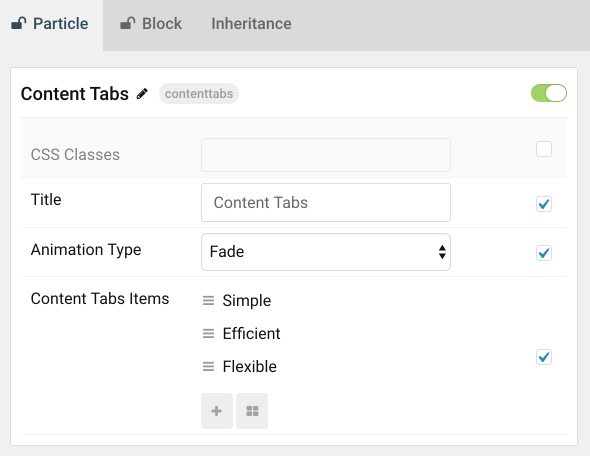
The Content Tabs particle enables you to pack a lot of useful information into a compact space that is easy to configure and intuitive to navigate.
Particle Configuration
| Option | Description |
|---|---|
| CSS Classes | Sets the CSS class for the content of the particle. |
| Animation Type | Sets the the animation type used when switching between tabs. You can choose between: Slide Left, Slide Right, Slide Up, Slide Down, Fade, and Toggle. |
Item Configuration
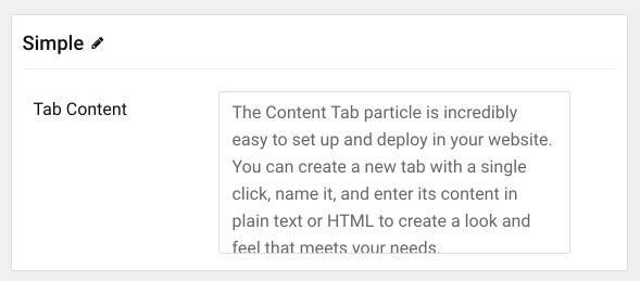
| Option | Description |
|---|---|
| Item Name | The name of the item becomes the title used for the tab on the front end. |
| Tab Content | Enter HTML content you would like to display in your tab as its content body here. |